Leadership at Alaska Airlines was generous in giving me the opportunity to take on a UX project as part of my transition into this field. I was tasked with redesigning the Atmos Rewards account overview page. The original design had been put together quickly for the initial program launch, and my manager wanted to get ahead of future updates by assigning me to improve and refine the experience. I collaborated with a Senior Product Design and have weekly review with my UX manager.
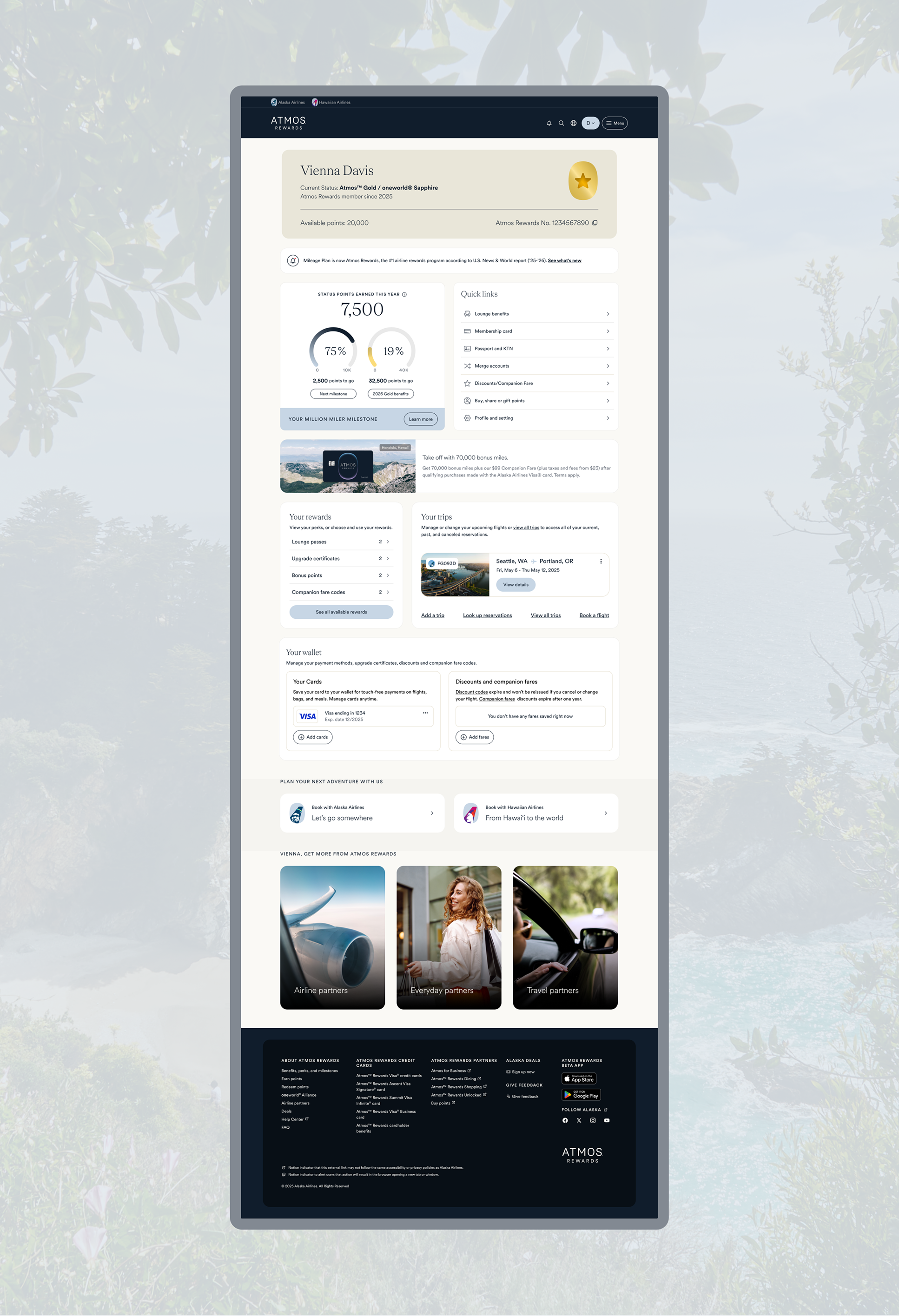
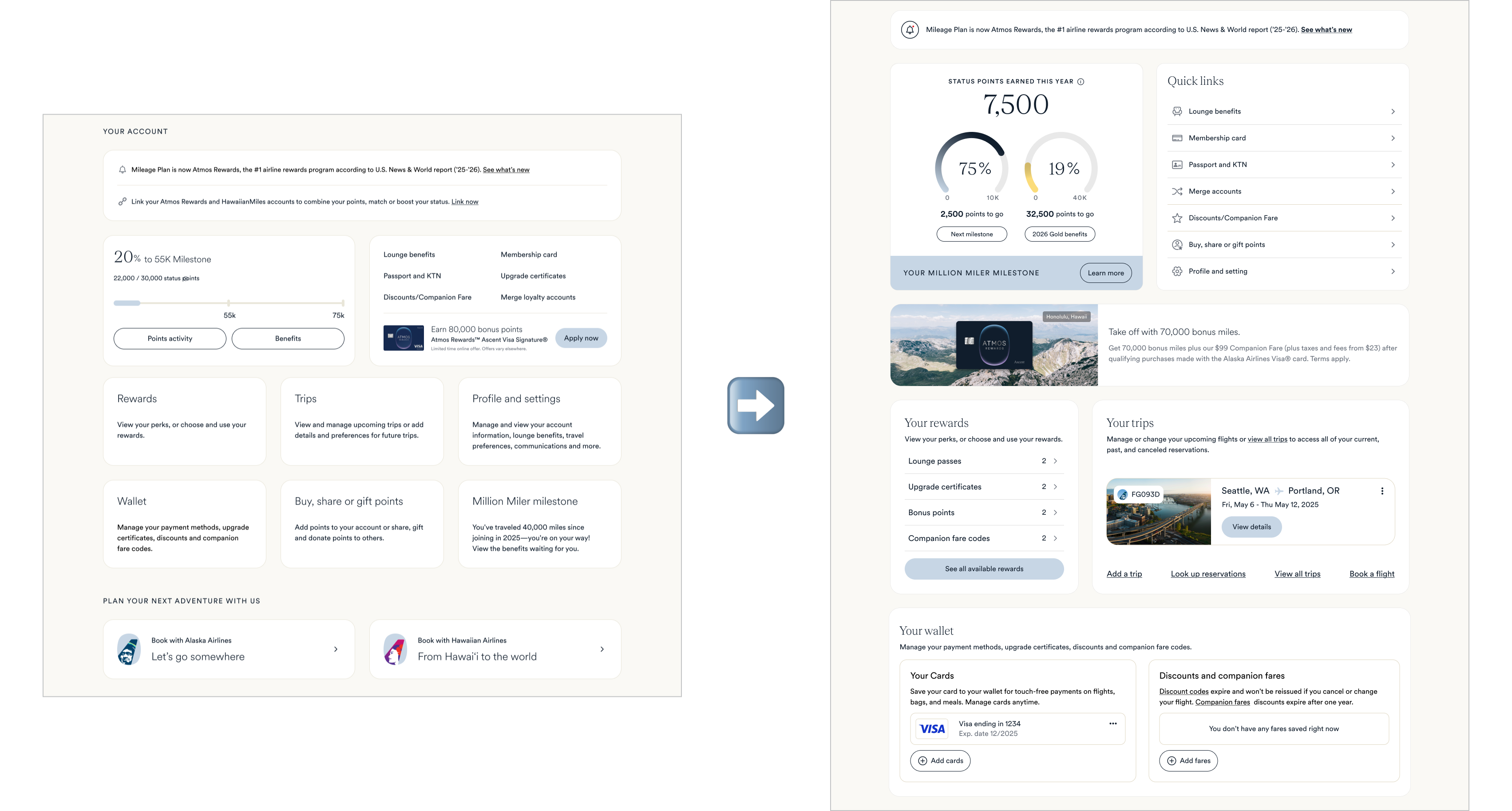
I redesigned the Account Overview for Atmos™ Rewards, transforming it from a static balance page into a personalized dashboard that gives members a clear view of their points, perks, card benefits, and key actions.
The Atmos Rewards account overview serves as the main dashboard for members to view and manage their loyalty status. It provides a snapshot of their rewards balance, trips, and other personalized information.
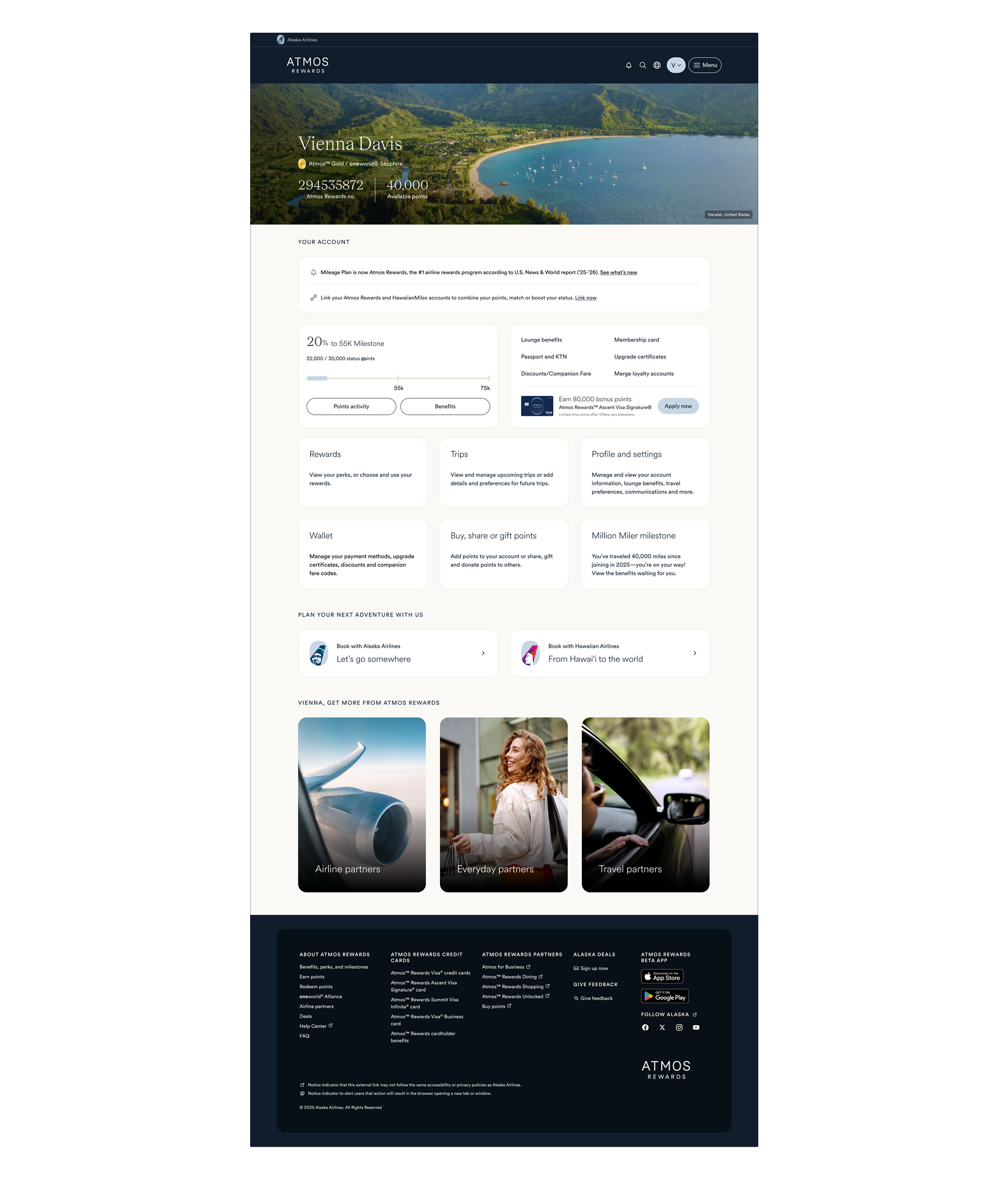
The main issue with the original design was its lack of personalization. The page displayed general information and redirected users to other links instead of providing tailored details or relevant rewards directly within the experience.
Heatmaps and interaction tracking revealed that users frequently clicked on non-interactive areas in the top half of the page, expecting an action, while engagement dropped significantly further down. Interaction with essential links was also low. Additionally, the points milestone did not match what was shown in the mobile app, creating inconsistency in the user experience. Finally, leadership requested more prominent placement for marketing content.
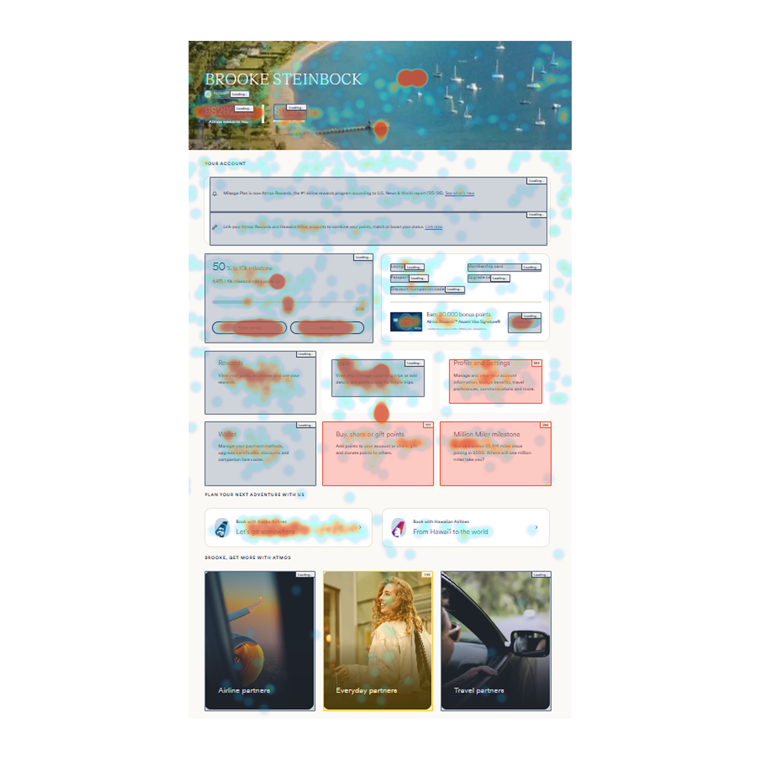
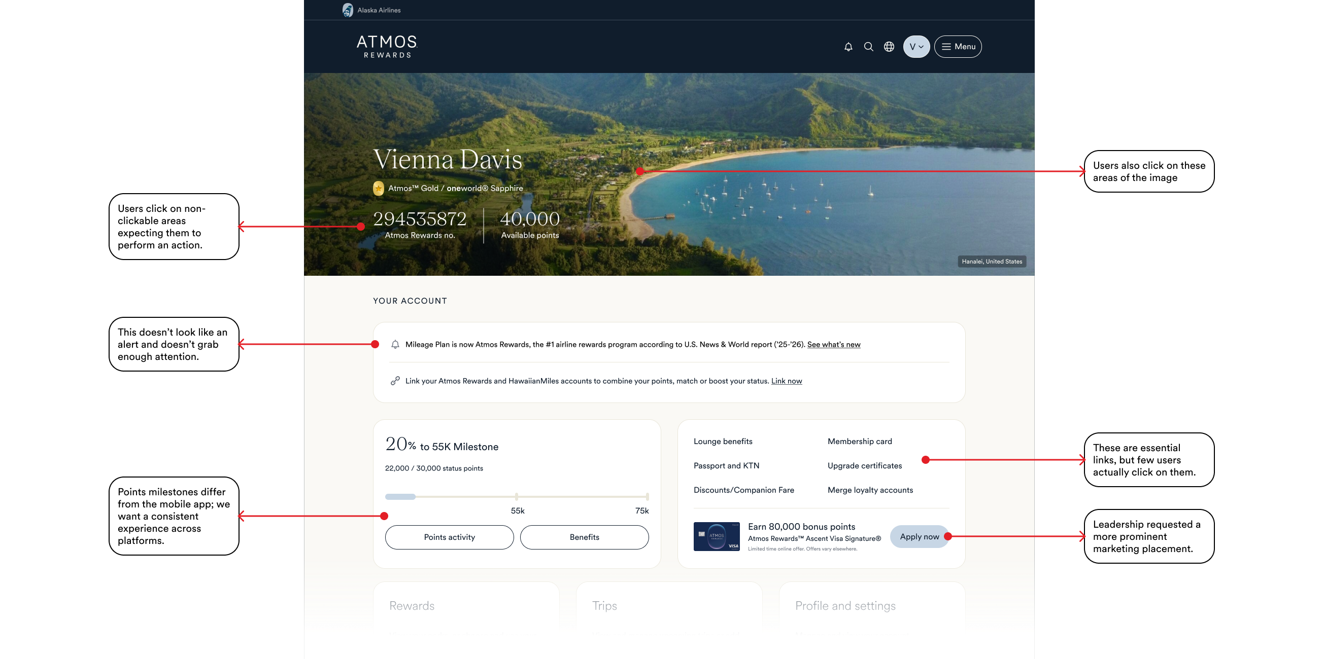
The decline in engagement further down the page is likely due to the cards not appearing clickable, with users only realizing they are interactive when hovering over the top. Additionally, the cards redirect users to other pages, which interrupts the flow of interaction.

The issue with the header image is it is not related to or representative of the dual brand identity of Atmos. Additionally, users are clicking on random areas of the image, expecting interaction. There is also an accessibility issue, as the thin text over a detailed image makes it difficult to read.
We initially explored options that preserved the header image while improving accessibility, but ultimately found that it still took up too much valuable space above the fold. Removing the image allows key information to surface earlier, reducing unnecessary scrolling and keeping users focused on what matters. We introduced a personalized membership card to prominently display the user’s status and provide quick access to copying their reward number .

We want stronger visual consistency between the mobile app and account overview, so we’re bringing the point tracker into the desktop experience as well. I refined the UI to align more closely with the app’s design system and also introduced a light mode version. This helps the desktop layout feel less heavy and creates a more premium, modern look overall.
Transitioned from a static layout to a personalized, interaction-driven design grounded in UX best practices. The new approach surfaces personalized information and rewards, while creating clear pathways for users to easily view and manage their trips. Instead of redirecting them elsewhere, users can now access and manage key account details directly from the Account Overview for a more seamless experience.
